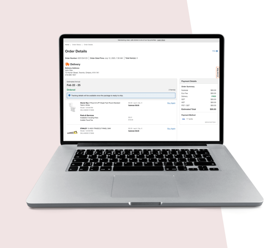
WHAT HAPPENS NEXT ONCE YOU PLACED ORDER
ORDER DETAILS REFRESH
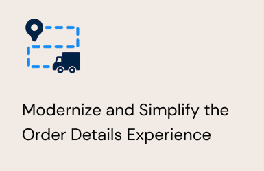
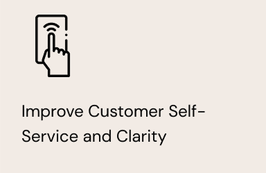
This project focused on redesigning the order details experience to modernize the interface and establish a scalable foundation for future enhancements. The primary objective was to empower customers to self serve by providing clear, comprehensive and real time order information, enabling them to easily track their orders without needing to contact the call center.
Team
2 Designers, Project Manager, Fufillment team, developers
My Role
Research, Design, Testing, Stakeholder management, annotate designs, UAT
Timelines
6 Months
+ Developement time
Overview
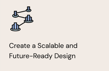
The existing Order Details page had become outdated over time, with new features added incrementally without a cohesive structure. As a result, the experience was difficult to scale, maintain, and evolve as customer needs grew.
This project focused on redesigning the Order Details experience to modernize the interface and establish a scalable foundation for future enhancements. The primary objective was to empower customers to self-serve by providing clear, comprehensive, and real-time order information, enabling them to easily track their orders without needing to contact the call center.
Goal
Challenges
- Aggregating Accurate Tracking Data Across Multiple Carriers
Order tracking information depended on multiple carriers and logistics partners, each with different data formats, update frequencies, and levels of reliability. Ensuring accurate, timely, and understandable tracking information for customers was a significant challenge.
- Designing a Consistent Experience Across Diverse Fulfillment Methods
Customers could receive orders through various fulfillment options; ship to home, store pickup, express delivery, or appliance delivery. Creating a cohesive and consistent Order Details experience while accommodating the unique requirements of each fulfillment type was a core design challenge.ers was a significant challenge.
- Providing Clear and Contextual Self-Serve Actions Throughout the Order Lifecycle
Customer needs change at different stages of the order journey. Designing self-serve options that surfaced the right information and actions at the right time without overwhelming users required careful consideration of timing, context, and clarity.
- Balancing Information Depth Without Overloading Users
The Order Details page needed to serve both customers who wanted a quick status check and those who needed detailed information. Designing progressive disclosure and clear information hierarchy was essential to avoid cognitive overload.
Research
To understand the needs, behaviours, and pain points of existing experience, identify gaps I conducted competitive analysis, user interviews, and analyzed online reviews.
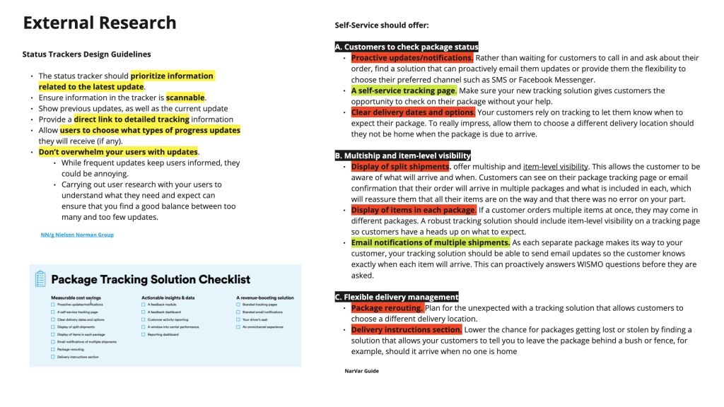
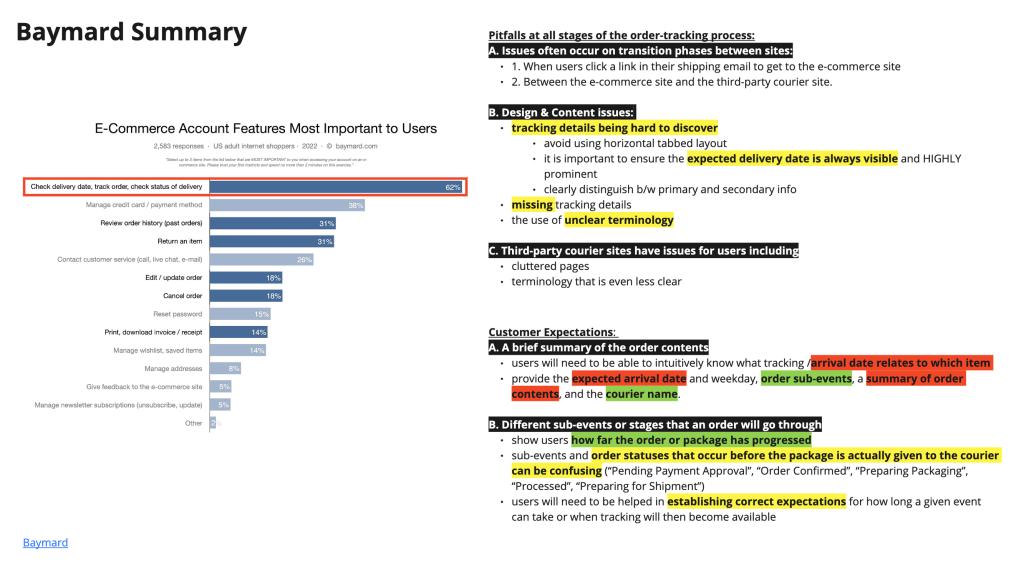
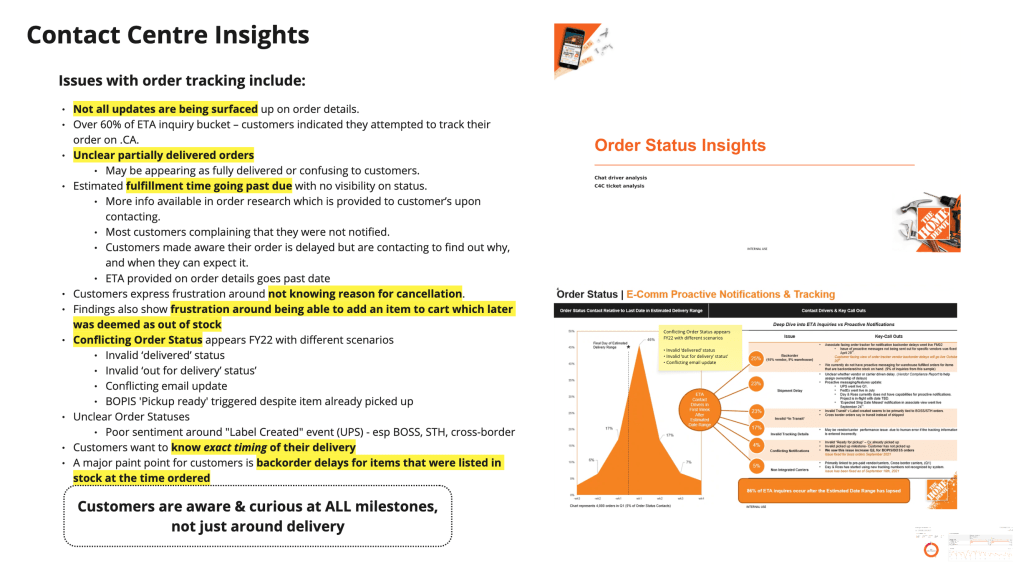
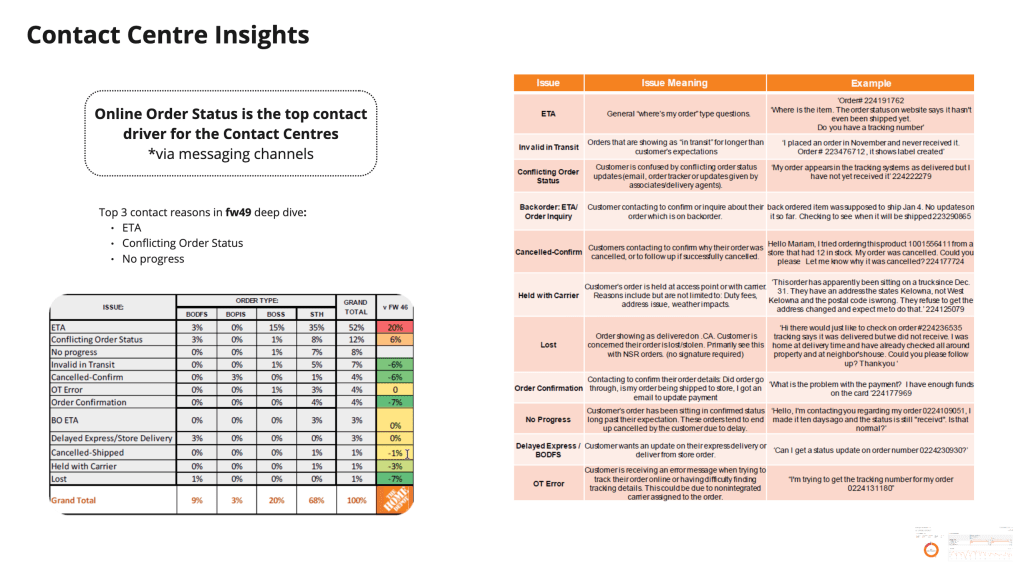
Conducted a thorough competitive analysis of E-com website focusing on their postpurchase experience.
Conducted user interviews with existing customers to understand their preferences and needs on order details page related to tracking and self serve options.
Conducted research for the best practices related to post purchase experience on baymard, nngroup and other websites.
Click on the image to view an enlarged version…
Research Summary
- Research consistently shows users don’t browse this page, they visit with intent.
- Competitive analysis shows best experiences surface contextual actions instead of hiding them
- Users frequently review orders at the item level, not the total order
- Users prefer self-service over contacting support.
- A significant percentage of users access order details on mobile, often from emails.
- Users cross check information between emails, order details page, order history and supportive conversations
From the research I know that users visit the Order Details page with clear, task-driven intent, primarily to understand order status, confirm details, and take immediate action. Confusion around status, pricing, and item level fulfillment is a major driver of support contacts. A successful redesign should prioritize clarity, contextual actions, item level transparency, and mobile first layouts, positioning the page as a self-service hub rather than a static receipt.
Discovery Workshop
Before exploring design solutions, it is essential to understand the technical lifecycle of an order after it is placed. Equally important is understanding the different fulfillment models supported by the business and how they impact the customer experience on the Order Details page. Delivery, express delivery, store pickup, and ship-to-store each follow distinct operational flows, with different milestones, constraints, and levels of visibility. Without this foundational understanding, there is a risk of designing experiences that either overpromise information, misrepresent order status, or cannot be reliably supported by backend systems.
This discovery phase ensures that any enhancements to tracking visibility are accurate, scalable, and aligned with real operational capabilities, while allowing the Order Details experience to be tailored appropriately for each fulfillment method.
Order Taxonomy
Current Workflow
Ideation
We started with a quick crazy 8’s sketching exercise, which we decided to simplify to crazy 4’s so that our business and product stakeholders could get more involved and share their ideas. Our sprint team met for 60 mins, taking 5 minutes to set up the exercise where we committed to keeping our sketches simple and only focusing on a single step each. We took the last 10 minutes of the meeting to explain our ideas and vote on our favourites.
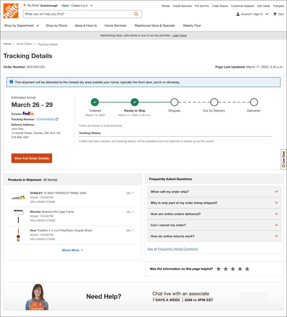
After reviewing all the sketches, the team aligned on separating the current Order Details page into two pages. The Order Details page will primarily focus on the current status of the order and self-service capabilities, while the Order Tracking page will focus on the tracking details of that order.
Scenario Mapping and Feature priotarization.
To spur ideation, I ran a scenario mapping session with IT, Business, UX, and Product. I used this technique to establish which scenarios and actions to consider at different stages of order tracking cycle.
With scenario mapping, we list out all the possible scenario can happen with customer orders multiple products of same fullfillment or different fulfillments.
Milestone Brainstorm and Label Testing
As part of the order tracking redesign, we conducted a milestone brainstorming exercise to define meaningful stages in the order journey. The goal was to identify milestones that accurately reflected backend events while remaining clear and understandable to users.
To validate the clarity of these milestones, we conducted label testing with users. Participants were shown individual milestone labels in isolation without additional context, visuals, or supporting copy and were asked to explain what they believed each label meant and what they expected to happen next. This approach allowed us to assess whether the language alone conveyed the intended meaning and progression of the order.
Insights from this testing helped us identify labels that were confusing, overly technical, or ambiguous, and informed refinements to milestone naming to ensure they were intuitive, self explanatory, and aligned with users’ mental models.
Design Review and Accessibiility Check
Now that we had some alignment, we moved from sketches to a higher fidelity mockup; my colleague and I presented our designs and then had Product and UX stakeholders deliberate and vote to gain feedback and move forward.
Home Depot is home to a vast assortment of components, so it’s important we align experiences across site sections. I analyzed the accessibility of proposed designs with our accessibility partners and ensured that the experience is optimized for screen readers and passes other accessibility guidelines.
Testing
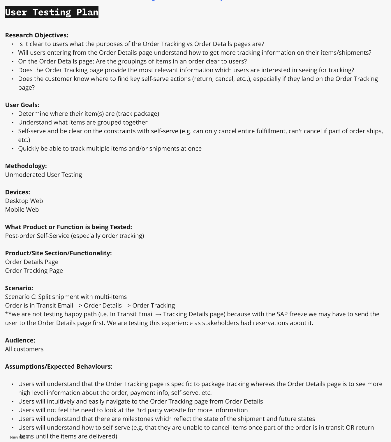
To validate these design, we iterated our solution and adapted our mock into a prototype to test with users.
I developed a user testing outline and collaborated with our UX research team to finalize the research questions, goals & assumptions so we might develop a test which could have the most impact in determining how usable our experience was.
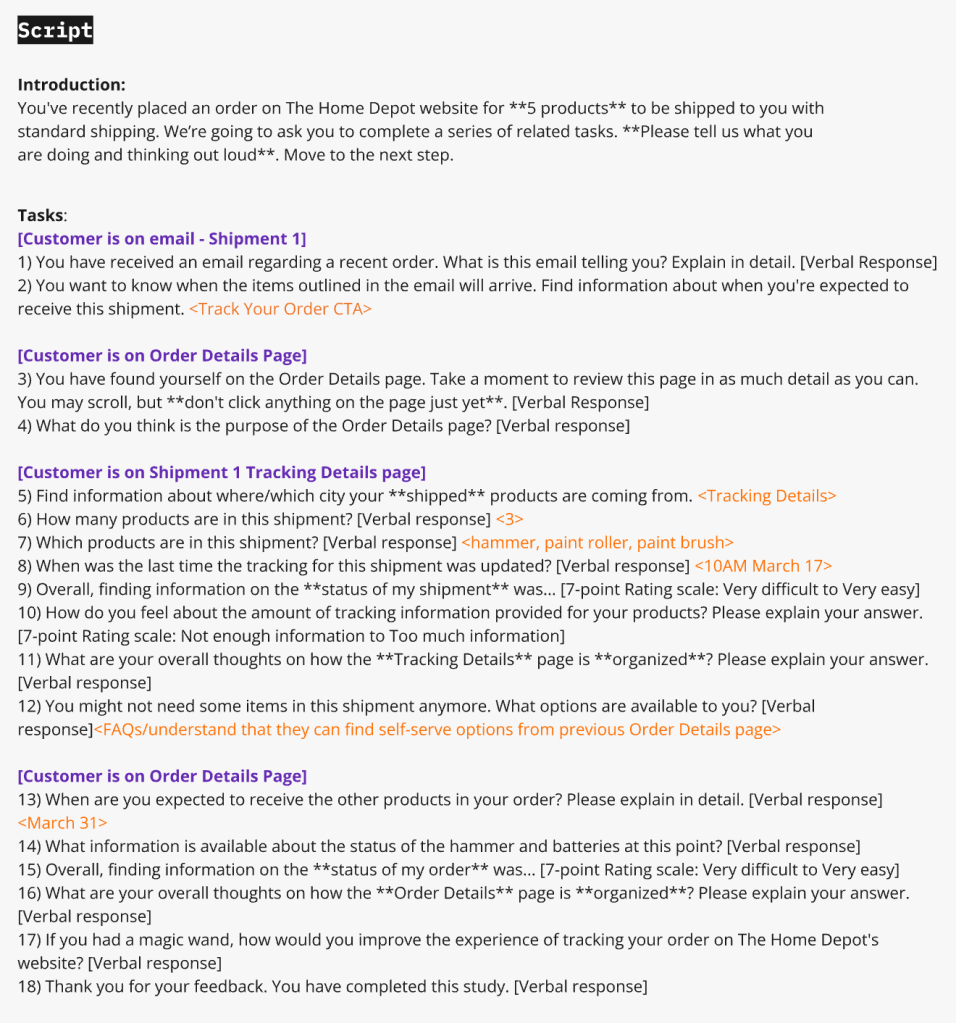
Once this was complete, I developed a script and presented it to UX stakeholders, alongside prototype requirements, research objectives, and expected user behaviours.
Affinity Mapping
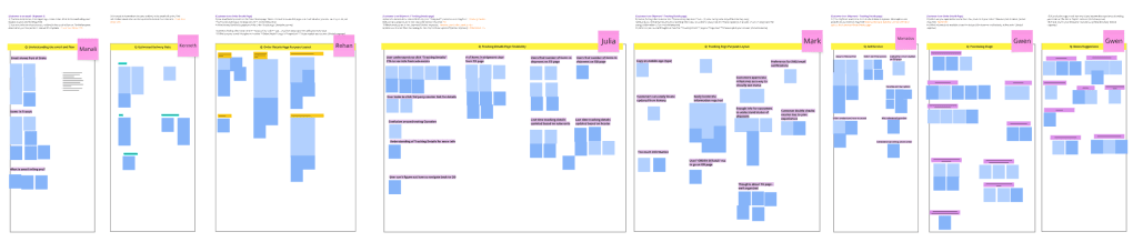
After my team and I reviewed the unmoderated tests, I facilitated an affinity mapping session to understand how users understood our experience on a task-by-task basis.
Affinity mapping based on user testing on Usertesting.com
Testing Insights (High Level)
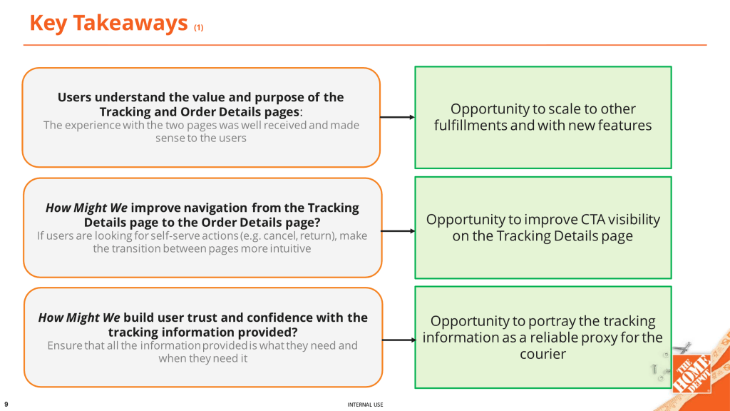
- Users clearly understood the separation of concerns between Order Details and Order Tracking.
- Order status clarity significantly improved compared to the existing experience.
- Users relied heavily on milestone language to understand progress and next steps.
- When information was missing or ambiguous, users defaulted to looking for support options such as courier website, contact support links etc..
Iterating and Retesting:
After iteration and re-testing, the experience was expected to deliver clearer navigation between tracking and self-service, stronger trust in tracking information, and improved understanding of next steps and limitations.
Improving navigation between the Tracking Details and Order Details pages helped users more intuitively move between monitoring their order and taking action, reducing friction when transitioning from tracking to self-service tasks such as canceling or returning items. Clearer CTA visibility on the Tracking Details page was expected to reduce hesitation and improve task completion rates.
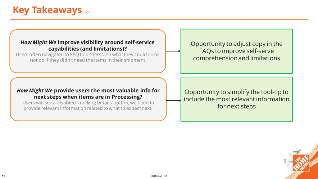
Enhancing copy and visibility around self-service capabilities and limitations helped set clearer expectations for what users can and cannot do at each stage of the order lifecycle. This clarity was expected to reduce confusion during processing states, where actions are limited but reassurance is critical.
Handoff
Once we were satisfied with the experience and were sure that all user issues were solved, we prepared the project to be handed off to product and development teams. This includes a long list of UI deliverables and documentation to create to make sure the transition between teams is smooth. Here are just a few examples:
- UI designs for all potential scenarios and annotations: Different fulfillment types, variations in quantity, orders with pending deliveries, notifications and error messaging are just a few examples.
- Copy documentation, including all new copy created for the project and their translations.
- AODA/WCAG compliance requirements like icon, link or image alt text where required.
- Updated and functioning prototypes to document intended flow and demonstrate animations.
How are we going to measure success?
The success of the Order Details redesign was measured through key performance indicators across customer self-service, operational efficiency, and experience quality. Metrics were tracked pre and post launch to evaluate impact.

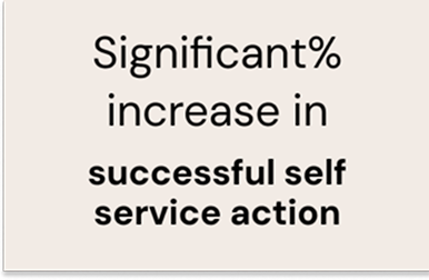
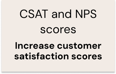
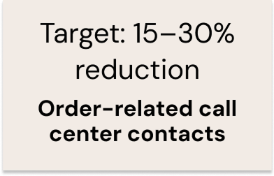
The redesigned Order Details experience was launched with Adobe Analytics and QM tracking fully implemented, enabling the product team to closely monitor page performance, customer behavior, and self service outcomes. Post launch insights are reviewed on an ongoing basis to validate success against defined KPIs, including engagement, task completion, and reductions in order-related support contacts.
Given the inherent dependency on courier and logistics systems, real world usage continues to surface edge case scenarios related to fulfillment status, delays, and data availability. These insights are actively fed back into the design and product backlog, allowing the team to iteratively enhance the experience and improve clarity for customers in non happy path situations.
This approach ensures the Order Details experience is not only performant at launch, but also resilient, scalable, and continuously evolving to meet customer needs as operational complexity grows.
